

This was our second assignment in my Typography course. It really encompassed everything that goes into making a font, which is WAY harder than it looks. We had to visually correct and refine letters to produce a legible and readable font, which takes many many drafts and steps, which you can observe below.

1. We started out by gathering rubbings of gravestone titles with interesting fonts and letter faces.
I must have looked like some sort of delinquent, running around a graveyard with paper and crayons and scribbling madly on headstones. Plus, I felt like such an intruder. I kept apologizing to the people who's names I was taking, but I reassured them, "It's all for the sake of Art!"
And as is sneaking around a windy, whispery cemetery wasn't creepy enough, a homeless man riding a bicycle towards me ended my adventure for the day and had me running for the car.

2. I chose "BEASLEY" because it had a range of letter types ad shapes, and I wanted a bit of a challenge. Also, it happened to be a serif font, instead of block letters or a specialty font, which also posed more of a challenge because all the little serifs would have to be made consistent in the end product!
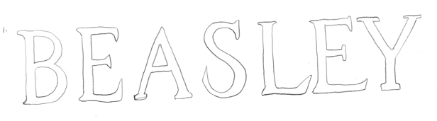
3. First trace of the rubbing. Lovely, right? Slanted, uneven, wiggly. Perfection.

4. Second trace. After our critique, I adjusted the kerning and the serif on the "S" so that it looked more cohesive with the rest of the letters.

5. This was the final trace of the rubbing. Letters are still slanting and are not sitting on a straight line. Also, the kerning between the letters is askew, but at least the serifs are a little more consistent!

6. After the final trace was complete, I scanned it into Illustrator and used the pen tool to trace it again. In the right hands, this tool is a magic wand, but for everyone else it can be a really stressful and tedious process. Luckily I was pretty familiar with it from other desktop classes, and managed to crank out my first draft fairly quickly. I did some basic tweaking of the letters before calling it a day. The "Y" is red because at the time I hadn't touched it yet.
You can already see that the bases of the "E"s, "S" and "L" look thicker and heavier than the rest, and really weigh the word down.

7. After trying to lighten the bases a little bit, the whole word looks a bit more balanced, but several of the letters are still giving me trouble. The "B" just is too thick and uneven, and the center of the "S" is distracting. Also, the "Y" is off center.

8. Here you can hopefully see a slight difference. The top is the word from the last step, and the bottom is another draft, where I attempted to fix the "B" and make it more even. I also tried centering the "Y" more over it's base, but it is still far from perfect. From far away, the "A" seems to be shrinking into the background.


9. At this point, I was rather annoyed. The "S" was just not coming together. The center was crooked and heavy and no matter what I did, it didn't change. Also, I used guides to try and line up the serifs on the "Y", but ran into trouble with the thickness of the arms, which is lighter on the right side. It gives the impression that the "Y" is falling over, or diving off a cliff.

10. My final draft. To be honest, I am still not 100% satisfied, but did my best to fix all of the issues as they came up. I learned a lot from this assignment, and learned that type designers must be the most patient people ever. I am not.
No comments:
Post a Comment